Monday, April 12, 2010

WP3: Pre-Write 2

Saul Baizerman's sculpture, Serenity, is certainly an interesting piece of work. Made of hammered copper, it hangs a few feet off the ground, suspended from the wall by four curled bands of metal. First and foremost, the structure seems somewhat human-shaped, like the curled back and upper arms and legs of someone sitting on the floor. This view is supported by the piece's material, as copper has a color quite similar to an earthy and somehow human tone, appealing to the onlookers via pathos. In crafting the structure from said metal, Saul's hammer work leaves many tiny dents across the figure's "skin," yet these little imperfections add to its humanity.
From there, it is important to note the less-than-human features of the sculpture. As stated earlier, the figure is not entirely created; the head and left arm are completely missing, and the remaining limbs end at or before the joints. It has no defining features, the things that we often take as giving us our identity, yet most, if not all viewers will likely still assume the subject is human. This is one of Serenity's most interesting facets to me. What exactly is the piece trying to say by this? Dictionary.com defines "serenity" as: The state or quality of being serene, calm, or tranquil," yet the sculpture appears to be facing away from its audience, grasping itself in a pose almost reminiscent of the fetal position. This evoked the greatest pathos in me, as I began to worry for the figure, and wonder exactly how "serene" he or she was.
The metal's cut also added to such ideas. When the edges are looked upon, they are quite rough in some spots, and not wholly straight. Was Saul trying to explain something about ourselves as humans? Like I said, this fact is not readily apparent, so perhaps there is some critique there about the "rougher parts" of our personalities, of our lives, which we try to hide from the rest of the world.
So, too, does the copper's color ask something to its audience. At first it is dark and rather drab, but when looked at closer in the right lighting, there is a pure and bright red hue about it. Even as the sculpture attempts to say something about the sadness and drabness of human existence, it also speaks to the greater brightness that populates life.
The copper, itself, does not seem as if it has had too much care of late. This may just be an effect from its station in the outdoor statue garden, but the metal is dark, dirty, and a little rain-worn. This may also add some interesting angles to its rhetorical appeals, whether intended by the artist or not.
The metal is interestingly tempered, to a point where it is thin and seemingly light, yet still quite sturdy. Sure, there are are a few stray holes about the structure, likely from the nastier bouts of Nebraska weather, but still holds up to most battering. Again, this could yield quite nicely to an analyzation of the human condition, as apparent from the utilized material.

Thursday, April 8, 2010

WP3: Pre-Write 1

Most of my experience with art objects is a little dated. Sure, I've been to plenty of museums and displays for different galleries, but personal involvement has been lacking in recent years.
As many kids my age, art classes were core curriculum for my elementary days. These early introductory classes gave us all a short look into what art could be, and allowed us to dabble a little in every area. And also start paint fights; that's what you get when you hand second-graders buckets of colored paint and minimal supervision. But besides that, things were never to rigorous.
Those of us who had some skill and enjoyed the work were able to produce some real quality pieces for our age. Often students' art would be placed about the school, or even in youth art competitions. I was lucky enough to have one of my own showcased at a gallery of teen art, though I was only in fifth or sixth grade; that painting still hangs on our dining room wall in my house.
Junior High was really the last time I was classically introduced to any class like this. Once we had such a large room to work, all the resources we could ever need, and several large kilns, our teacher allowed us to step up our game. That's where I learned my love of pottery and sculpture. It had always taken me so long to draw something, my painting skills were lack-luster most days, and forget just about anything else that required that much patience. But getting right to work with my hands and physically molding something really clicked and came naturally to me.
After that, my interest remained, but my options didn't. I couldn't fit in an art class to my high school schedule and I really had no other outlet. The closest I came was when I was given some modeling clay after a local art shop started putting them on clearance. Most of those sticks still have yet to be used, but on one rainy day, I did produce a few amateur pieces which appear on my Facebook photo album.

Monday, April 5, 2010

WP2: Final Comic

Author's Note

In trying to break from the usual monotony of wordy posts, I took the opportunity to design my own comic, rather than analyze someone else's. While this saved me some time in struggling through word-counts and textual revisions, creating the work was no walk in the park, either.
The comic genre is not something that is normally taken as a form of literature. As many pop-culture enthusiasts will be more than happy to explain, the general public still sees comic strips as something they read in the Sunday paper or something for children; even major works like Watchmen receive scoffs when someone tries to assert it could be on a level with The Great Gatsby. Especially with the aforementioned work, that is not to say that real, difficult topics cannot be explained through such an art form. That is precisely what I aimed to do with my strip: use comics as a means to discuss hard issues, but with lighter, more aesthetically pleasing visuals than would accompany a standard work of scholarly prose.
My series of panels (here placed in a slide show) went through several iterations, but began their life, surprisingly, as a poem. Poetry is a style of writing very dear to my heart, and it comes quite naturally to me these days, particularly when it has to do with those closest to me. That's why I decided to begin in text, where I could get my thoughts down, while playing with a rhythmic feel to give the piece a sense of pacing.
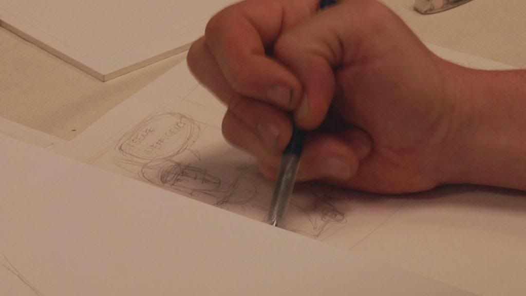
After I had found the words, I went right to sketching out my panels. I knew that in trying to emulate the feeling of Andrew Ryan's monologue, I would also do well to implement the visual style that Bioshock designers put along side it. So I started with the middle four (originally planned to be five, but "'No!' says my counselor, " was eventually scrapped because it felt monotonous and unnecessary) panels, finding symbols of each group to use threateningly. Keen observers will note in these frames, many references are made to various source materials.
But I knew, after having all of the panels laid out, that I wanted to push the envelope more. Something had to be done to break my work from the standards of a comic strip. While working on in-class reviews, John brought up the idea for the final frame, bringing it out of the hard square edges of all the others. This is a means of symbolism for the piece: my words are of constraint and hopelessness in all but the last frame, so they should remain in their own stark black borders, while the final shot has none.
Another interesting innovation is likely the most obvious: rather than place the panels into a rigid and page-like framework, I opted to place them in a slide show. Not only does this utilize the abilities and norms of the blog and internet, it also brings the piece closer to the source sited in my Statement of Purpose.


(Click the slide show at any time to see the current panel in greater detail)

Saturday, March 27, 2010

WP2: Statement of Purpose


Whilst designing my own comic strip, I aim to detail the stresses and seemingly strange incongruities of the teenage and college-age life, by playing the romanticized view of these events against the realities I have come to understand. This is accomplished through the combination of free-verse poetry of language and the visual components which will enhance said words. Thus readers will come to better understand an almost dystopian view of education, work, and the first years on one's own. This is not intended to be the woeful ramblings of the ordinary teenage blog post, but instead draw upon these feelings of mangled dreams and a graying future, refining them and crafting such feelings of angst into a calculated and intelligent work of art.
As with any of my creative works, this project draws heavily from my own experiences mixed with the media I have raised myself on. This is apparent through the text used in this comic. The words, originally written in a form of prose nearly bordering on a loose definition of poetry, arose from experiences most of my peers may be able to associate with, and events which professors and others above my stature can comprehend. For the average student looking to break out of high school and come into themselves through college and the job market, it can be jarring to realize how tedious class life can be. Some classes are repeats and quickly repainted versions of the free education students have just finished. Few seem to really bend the mind as strongly as previous teachers had lead them to believe, much like before in their school careers. In saying this, I draw attention to a fact many of my peers have discussed: in grade school, we were told of how difficult junior high would be; it was not. In middle school, they told us we would have to be prepared for a whole new world in high school; such was not the case. And in our final years before graduation, instructors spun horror stories of strenuous classes, unforgiving professors, and papers and tests longer than we could possibly imagine; this blog is a testament to the fallacy behind these terrifying foreshadowings.
In addition to the context of the writing, the style itself draws upon sides of the media many of my fellow web-browsing readers will understand, and hopefully pick up on without my direct naming. For the rest who are not within this scope, or on the account of the possible confusion of this aspect, allow me to explain. The ideas housed in this work reflect upon a childhood many Westerners, and especially Americans, should be able to understand. While the early stanzas are quite depressing, the final lines show a sense of hope and beauty through young love. Such motives draw from works akin to Walt Disney, and others who write such "Happily ever after" romances to wrap up a greater critique.
The middle panels, with their somewhat repetitive nature, ask of allusions to a different category of reader: the gamers. Fellow nerds and meme-users will hopefully catch on to the parallels drawn to the opening scenes of the rising classic, Bioshock. But where the antagonist, Andrew Ryan, speaks of ownership and rights interceded by government and religion, I frame my work of dreams and hopes against men and communities, with a more light-hearted ending.

Sunday, March 21, 2010

WP2: Pre-Write 2


In viewing Qwantz number 944, it is interesting to take note of what was happening in the outside world when Ryan North was creating this particular entry. Going back through his site's records, this issue was released on January 5, 2007, which gives the reader a good place to begin chronologically. But what kind of exciting events were surrounding this time in Canada and abroad?
Earth Observatory has quite a full list of natural goings-on around this date. This includes earthquakes, disease outbreaks and a healthy amount of global climate worries. Looking centrally at Canada, though, the list is staggeringly small; "Canada Worrying About Plunging Caribou Population." Somehow it seems hard to draw a line between T-Rex's superhero, Lee, and some caribou quandary. HavenWorks.com references struggles about the Iraq War and the race for the 2008 US Presidential election. Again, not much to do with Stan Lee-type dreams, or even Canada in itself. Perhaps, then, our views are yet too wide.
On the whole, Dinosaur Comics are quite light-hearted, and very rarely make comment toward major world issues. North chooses, instead, to keep his characters mainly grounded in their own world, thinking more about the challenges that befall everyone (and, more often than not, everyone with as free a spirit as T-Rex). On top of this, the author also coats his work with a fine line of pop-culture references and internet memes. So let us take a look at what was going on in the world, in a less grave sense.
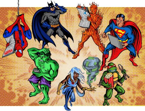
Taking a quick look through the tubes we call the Internet, a refresher course on the major movie releases of the previous year may give the audience a bit more information. 2006 was a major year for comic book and superhero-based movies. Early in the year saw the release of V for Vendetta, X-Men: The Last Stand, followed by Superman Returns, and My Super Ex-Girlfriend (not inspired by any work, but enough within the genre to make some count in the film culture). This series of films only invigorated producers to keep on with strong titles from Marvel syndicates, and add on many, many other works featuring tight-wearing crime fighters. Being a comic book nerd was suddenly kind of "in," and being a writer with a good creation even better. And that is really what T-Rex is working for in this particular strip; a way to break into this new and budding market. With what he believes to be such an amazing and interesting character, the big green guy hopes to bring his own intellectual property to the forefront and make it in the new superhero-saturated market.Of course, with a work like “Super Lee,” it is somewhat hard to take him seriously. In looking back on the history of the genre, though, is it truly that outrageous? The biggest names in caped crusaders are an awkward teen with the powers of a bug most people revile and kill on sight, the literal interpretation of the works of Nietzsche, an aged orphan who uses high-tech toys and a gravely voice against his foes, and a short, hairy man with claws made of some made-up metal. Not the most amazing creations when broken down, so perhaps our prehistoric friend does have a chance with his adverb-wielding warrior.